DOTA 2 Workshop Item Production Pipeline
Scott Martin
This page covers steps I took to create an item for DOTA2.
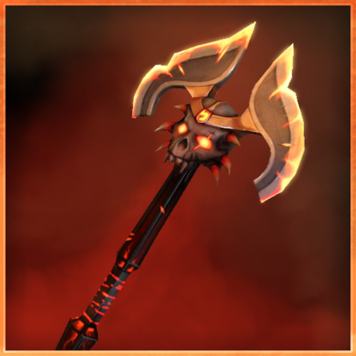
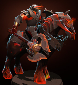
It is a right hand weapon for Chaos Knight, named Axe of Disdain.
RESOURCES
Main Specs, including 3 PDF guides on creating DOTA2 art.
The links to the art and texture guides are essential for the process,
and should be reviewed before and during the process of item creation.
http://www.dota2.com/workshop/requirements/npcsMain Tech Wiki
https://developer.valvesoftware.com/wiki/Category:ModelingHow-To Guide, example from another artist on making an item
http://steamcommunity.com/sharedfiles/filedetails/?id=149270397smd export plugin for 3ds Max
https://developer.valvesoftware.com/wiki/3ds_MaxMarmoset Tutorial on Materials
http://www.marmoset.co/toolbag/learn/materials
SOFTWARE
- 3ds Max
- ZBrush
- Photoshop
- Topogun
- Marmoset
- xNormal
- Word
- Excel
DOCUMENTATION
Early on I started a list of all major steps needed to produce an item, using Excel. This helped me make sure I checked things well if I had to redo or rework a part of the process. I also started a document with notes from working, including a to-do list, main links I needed, and main specs I needed for potential heros. All of this is on the web, however it is nice to consolidate the most useful information in a document. I like to make text notes in 3ds Max. Sometimes this text is just the basics of the specs, or what I need to work on next time I open 3ds Max. I make a note using the Shape/Text tool and leave it in view to see again when I open the file.
GETTING STARTED
When I set out to make a DOTA2 item, finding the information I needed was relatively easy, using Valve's websites, the game, and the online community. Choosing a design that worked for a DOTA2 hero, that would be unique, interesting, and complementary of the hero, was the biggest challenge.
I first started working with 3d many years ago. Having this experience made creating a DOTA2 item doable. In order to meet the demands of this kind of project, an artist will need a solid knowledge of the 3d production process. If an artist wants to stick to concepts, they will need to partner with a professional 3d artist or an ambitious 3d art graduate. If you make concepts for DOTA2, it is very helpful to have a thorough understanding of 3d. Someone new to 3d can definitely do this if they are patient, thorough and resourceful.
CONCEPTS
After sketching out ideas for weapons, shields, couriers and outfit sets, I honed in on a design that I thought would work, and one that had a reasonable scope for doing my first item. A courier or outfit would take several times longer, have their own identity, and are very different types of designs, whereas an attachment for battle is a more concise type of asset, and one that complements the character. I wanted to tackle something I could finish in a reasonable timeframe while figuring out what it took to get something tested in the game. I gave myself about a month to produce an item. During that time, other DOTA item ideas were developed and other freelance projects were being worked on. From start to finish, this ended up taking about a month.
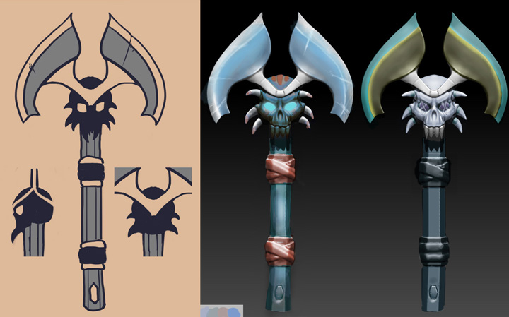
Once I chose a design, I worked to create different variations I thought might work, while going back and forth between a weapon for Chaos Knight or Ember Spirit, wanting to work within those color schemes. I worked on other color variations that better matched other heros but the nature of the item was better suited for a darker and fiery hero. I focused on Chaos Knight. An initial sculpt was started to establish scale, proportion and silhouette. I also started to create the story behind the axe for its description. To establish the scale, download the source files for the hero and build your 3d file, taking note of the size of the item you will replace. Be sure the objects going to ZBrush as obj files or through GoZ, match the scale of the imported hero.
ZBRUSH SCULPT
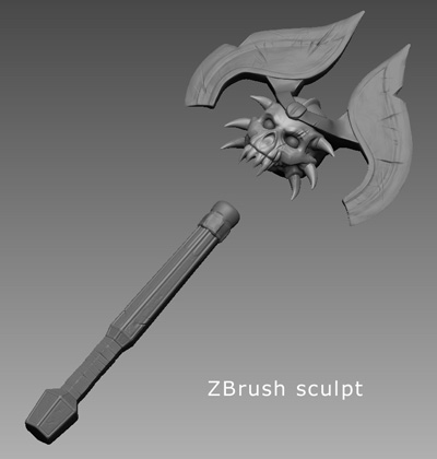
For the main 3d work, I used ZBrush and 3ds Max. The Axe was broken it to several subtools - the blades, the golden helm, the skull, the connecting piece between the skull and handle, the eyeballs, and the handle. The blades and helmet were started with Dynamesh then ZRemeshed for better control of the shape.
The handle was started in 3ds Max and brought in to ZBrush as a low poly mesh. I used GoZ to go back and forth between ZBrush and 3ds Max. I reinforced the edges of the handle shape, with edge loops in 3ds Max to better subdivide it in ZBrush while it maintained its general tapered hexagonal shape. I used radial symmetry to add detail to the handle, then turned on Y symmetry and turned off radial symmetry to create unique detail on the top and bottom sides. Later, I turned the mesh 90 degrees to burn the mirrored detail on the X axis. I turned this back using a morph target on the final LOD1 mesh that both turned it 90 degrees and pushed it in to the skull.
I started the blades with Dynamesh to get an organic shape going that I molded and pulled in to the general shape with symmetry on both the X and Y axis. Once I got a shape that was close I used Dynamesh again and ZRemesher to get a better topology. I continued to sculpt the blades and focused on overall form and shape relative to the whole weapon. Symmetry was kept on until very late in the process. I tried a couple different assymmetrical tests then went back to working with symmetry. Once that was ready, I used Y axis symmetry only and turned off X, then carved the gashes on the edge, and put in various big scratches to push the asymmetry more. The illumination map is painted asymmetrically as well. The LOD mesh was imported as a subtool to better conform the high poly sculpt to the low poly silhouette and to tweak the LOD mesh proportions and vertex locations. I zoomed out often to evaluate the silhouette from all angles. In ZBrush, I applied a silhouette material to the axe when viewing it at a distance. I also lighten the default background color. Shift-S is used to capture several angles of the item, then a quick screen grab to save the array of silhouettes.

After an initial sculpt in ZBrush, I did some paintovers in Photoshop trying to figure out the ideal color scheme. This kept me focused on the silhouette more than the colors. As I built the handle and axe blade, working back and forth with 3ds Max and ZBrush, I regularly backed way out in my view to evaluate the shape and silhouette, using black on grey to further focus only on the silhouette. I started to work with the higher level of detail, LOD0. Early on, I did a test to ensure I could maintain the silhouete with LOD1. My specs were 650 tri's (LOD0), 350 tri's (LOD1), 256 texture size.
LOD CREATION
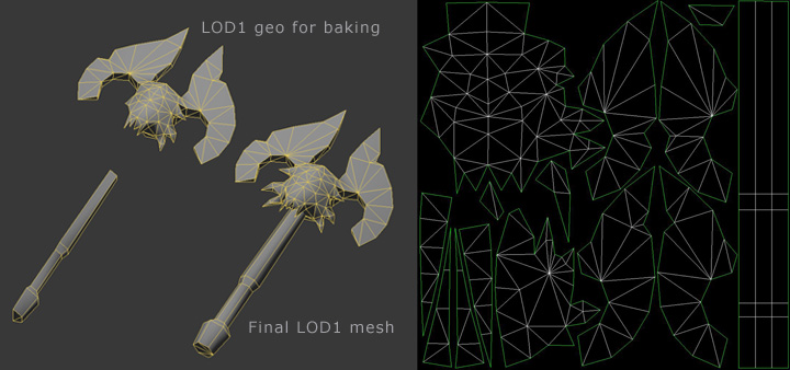
Once I had a reasonably detailed sculpt, the LOD1 was started. I didn't wait until the sculpt was 100% but I knew I had the main shape in place. I started the LOD0 topology in ZBrush, but ZBrush isn't a great tool for complex retopology. I exported that mesh for Topogun and continued to work on one side of the retopo'd mesh, moving and shaping the mesh for output to 3ds Max. Once in 3ds Max, I cleaned up the geometry, mirrored it, and was above the 650 triangle limit. Working in Max to collapse edges and weld verts, I got the triangle count to 650. I copied this mesh and began testing to see if I could further reduce it to 350 for LOD1. I was able to get really close and felt confident that I could get the current detail on this 350 triangle mesh.
I did tests on the LOD0 to see how the normal map and AO would look in Marmoset. I used 3ds Max to layout the UVs in the 0 to 1 space, cutting out geometry that would be mirrored with offset UVs. I saved out a low poly in-game test object with 650 tri's and viewed it with the normal map and baked AO on the color map in Marmoset. This gave me a lot of information to make final edits and adjustments, and to kill feature creep on the design. I continued to back away from the design to evaluate it. I also tested use of a Morph target to get the LOD mesh in to its final shape, and tested the scale and position relative to the hand bone.
Using the ZBrush sculpt, I did a quick mockup of a Chaos Knight screen grab and a marmoset screengrab to test if i was on the right track. I wanted to make sure the design was within context since it would be an extension of the hero as much as it was its own thing.
I used 3ds Max and Topogun to refine the low poly mesh for the 2nd test. Then, used ZBrush and 3ds Max for further adjustments. I stripped away parts of the geo that would have overlapping UVs then reworked the UVs of the LOD1 mesh for optimum UV coverage. I merged subtools in ZBrush to create 2 meshes - 1 super hi res to decimate, for baking the normal and AO maps in xNormal, and 1 medium res used to bake out rough polypaint for the color map.
TEXTURE MAPS
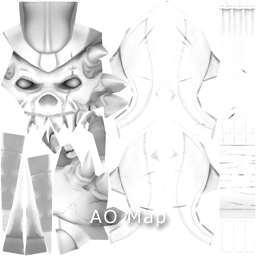
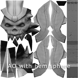
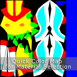
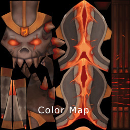
I baked the normal, ao, and color maps in xNormal and assembled a master file in Photoshop, following the texture guidelines, then baked an optional ambient occlussion map with a hemisphere in xNormal to better control the top to bottom shading of the weapon and emphasize the detail. Next, I created a master normal map file, cleaned up issues in the normal map not solved during the main texture bake, and used 3ds Max to create lightmaps with mental ray. Then I combined the different lightmaps in Photoshop and brought them in to the master file. Separate groups were created in the master psd file for mask channels, and another master psd file was made for the 2 masks, grouping the 4 channels for each. I returned to ZBRush to paint bright colors on the sculpt to separate materials, then burned an alternate color map in xNormal to more easily create UV selections in Photoshop.
TESTING
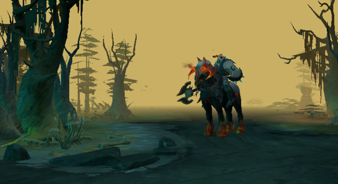
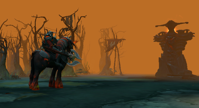
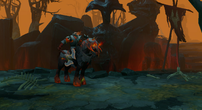
I saved out the 4 main textures and reduced them to 256, then uploaded the smd and 4 tga files through the item submission page. I captured initial screenshots for evaluation, viewing the axe in-game on both sides of the battlefield in both lighting scenarios, at multiple angles, following the hero around as he rode, making a list of final improvements. I finessed all 8 maps - color, normal, 4 maps for mask2, and 2 maps for mask1. Small geo and UV changes were made, then the final axe was assembled. I positioned the final axe LOD1 mesh relative to the weapon1_0 bone and skinned the axe to it, then exported the smd file with the 4 main maps for DOTA2.
I prepared a higher quality preview image for display as the main image in the workshop, and finalized the wording of the description. Then I captured multiple screenshots from the game and created master psd files for preview images to accompany the item submission. Having all the items to upload, I finalized the submission for the Axe. A couple days later, I made scale adjustments to the axe and updated the preview images.
TECHNICAL CHALLENGES
One of the more challenging crossroads of the process was to go with lower resolution on a non symmetrical design versus a higher resolution and easier workload with a symmetrical design. The asymmetry contributes a lot to the character of any item, so I went with that instead of making the blades the same. I gave both sides of the blades their own mapping coordinates since the geometry was a little different on the back side. Another challenge was fitting this detail in to a 350 triangle mesh. All in all it was a very fun process and I'm better prepared to make another item.
It's best to make the item as finished as possible prior to upload. After a short time, you should get some indication of its success, based on the votes you get and comments left on the site. The display of your item among the main pages of items submitted will last one week.
Many thanks to Marko, Max, and Rui for their help.
Scott Martin
smartin@martinarts.com
martinarts.com